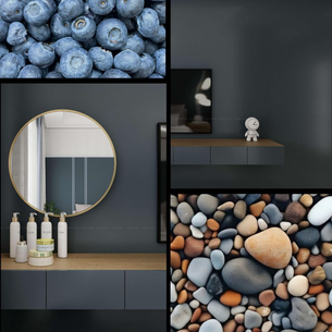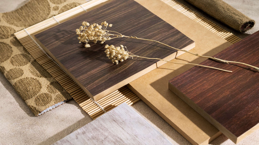
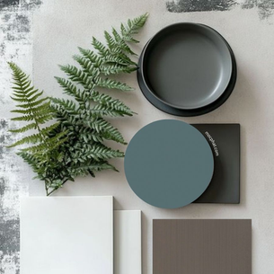
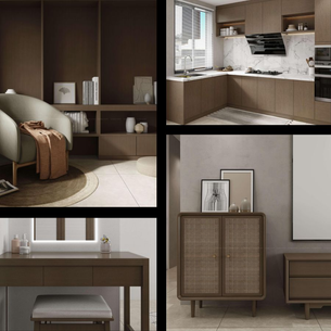
Moodboard - Gentle Color Combinations for Interior Spaces


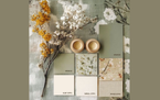


Color plays an important role in interior design, not only helping to create aesthetic beauty but also affecting people's moods and feelings. One of the popular trends today is to use a gentle color palette, bringing relaxation and sophistication to the living space.
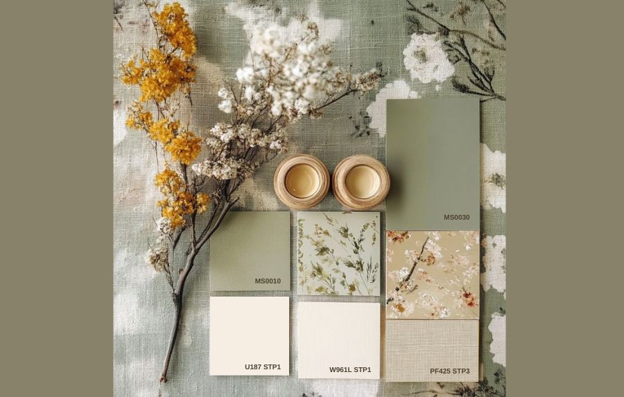
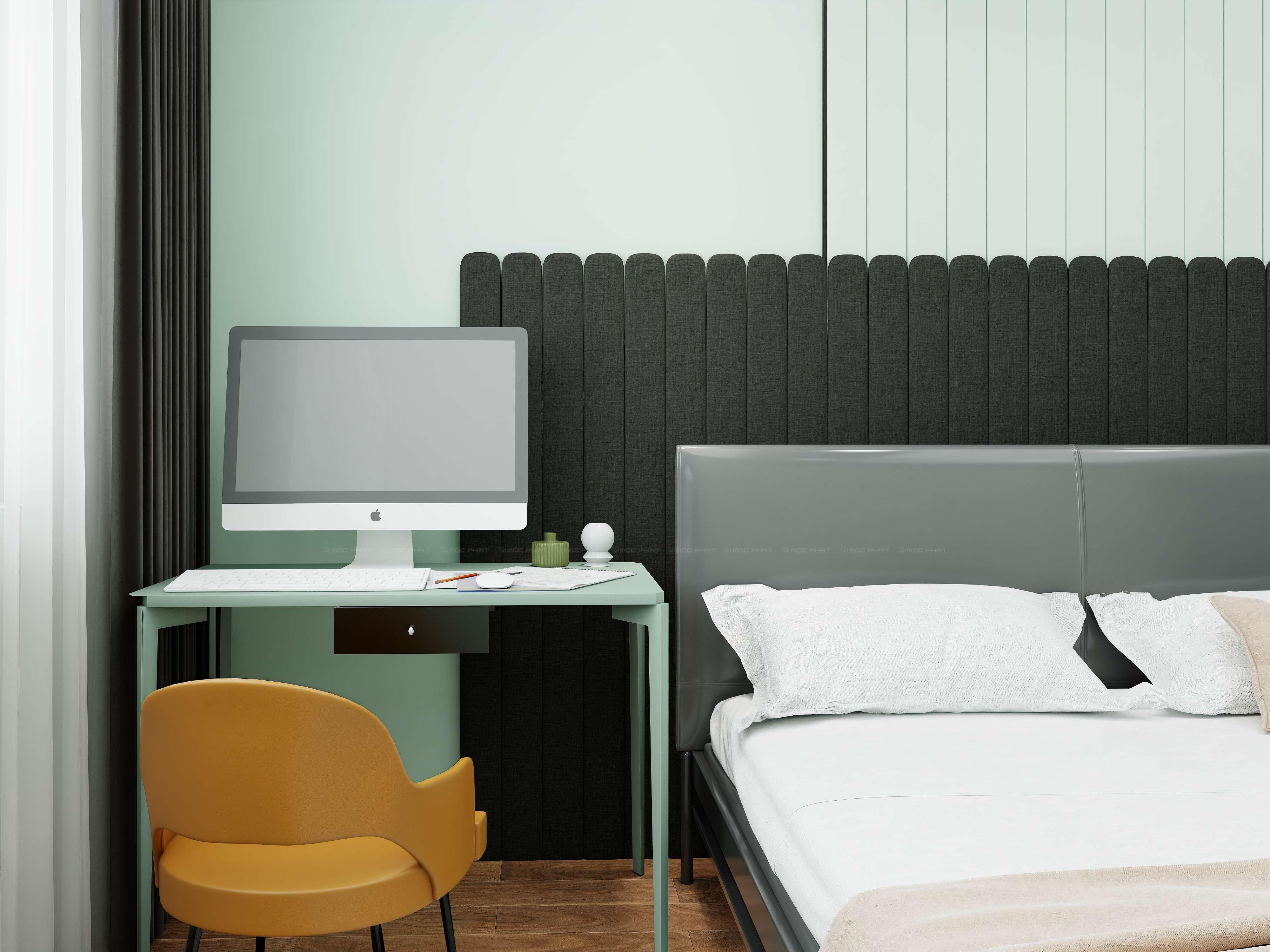
The Perfect Combination of Natural Color Tones
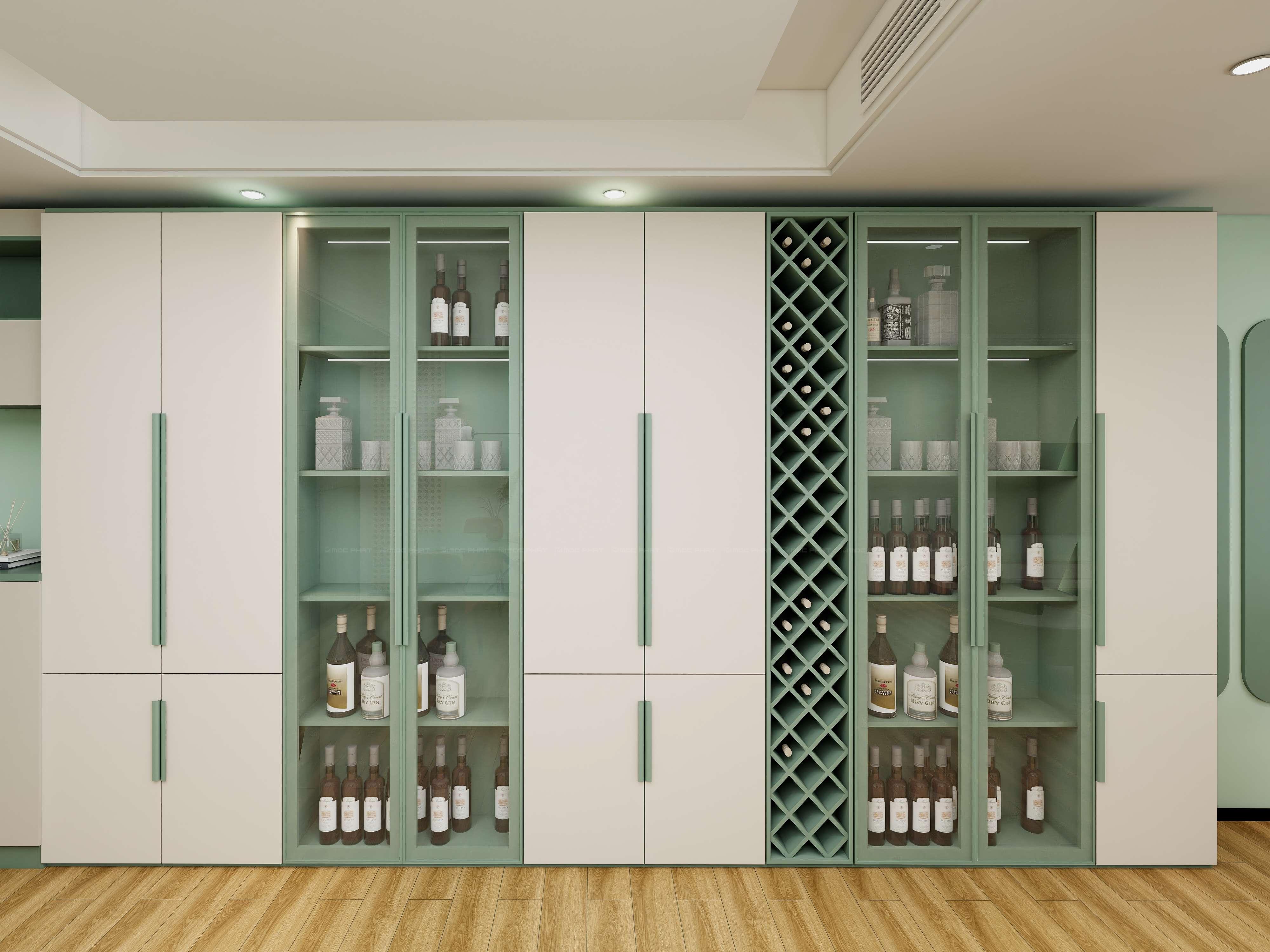
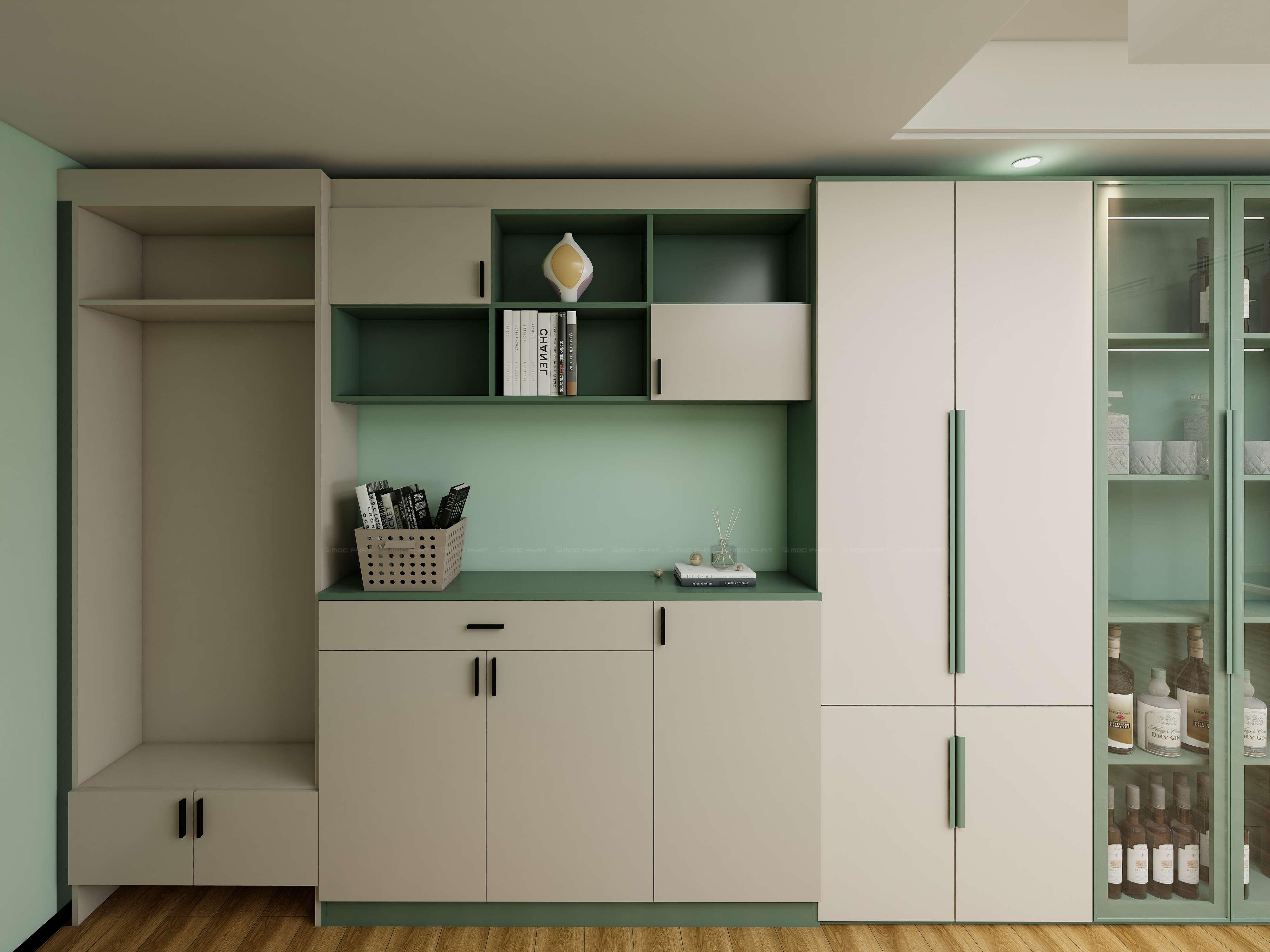
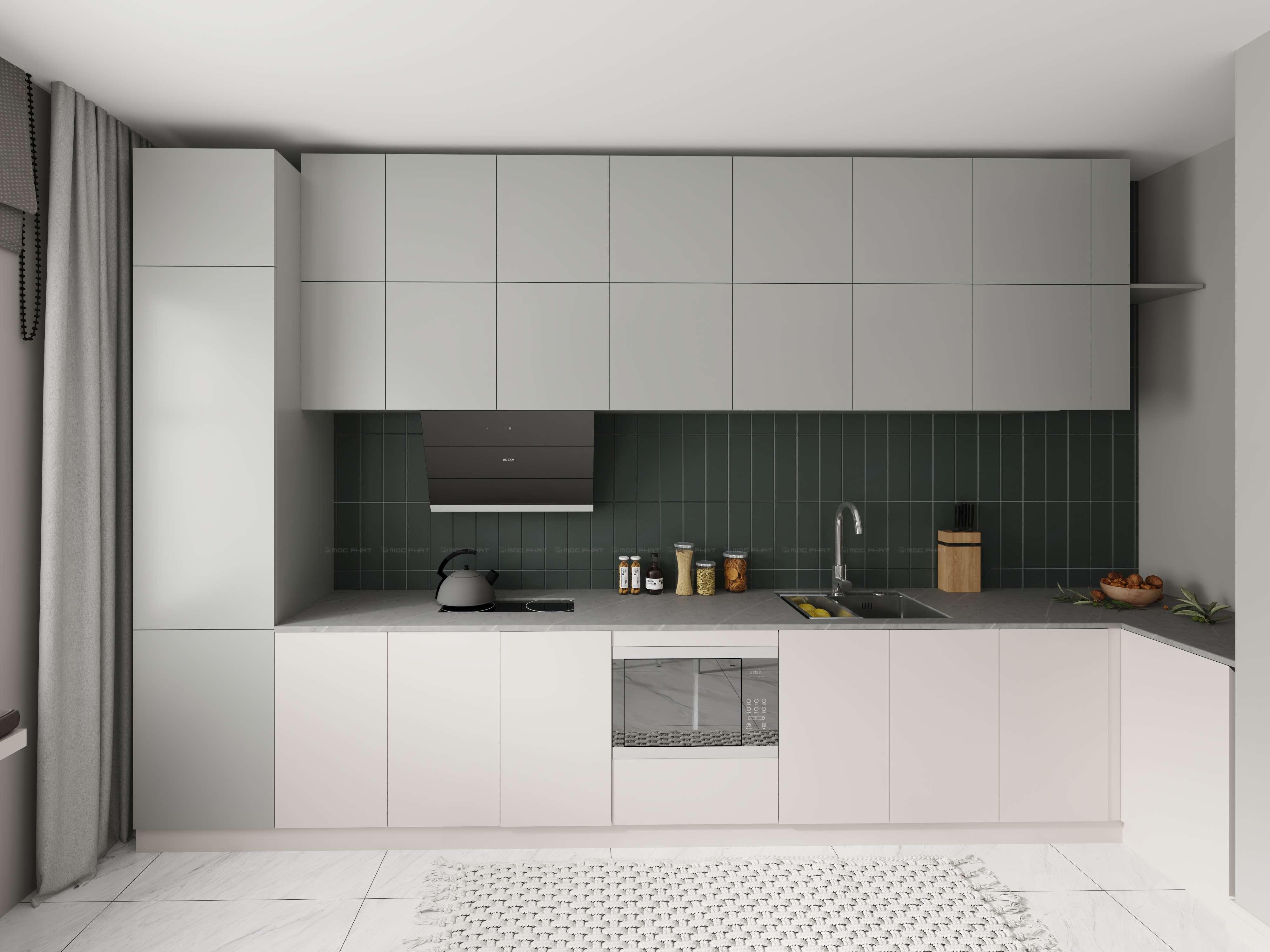
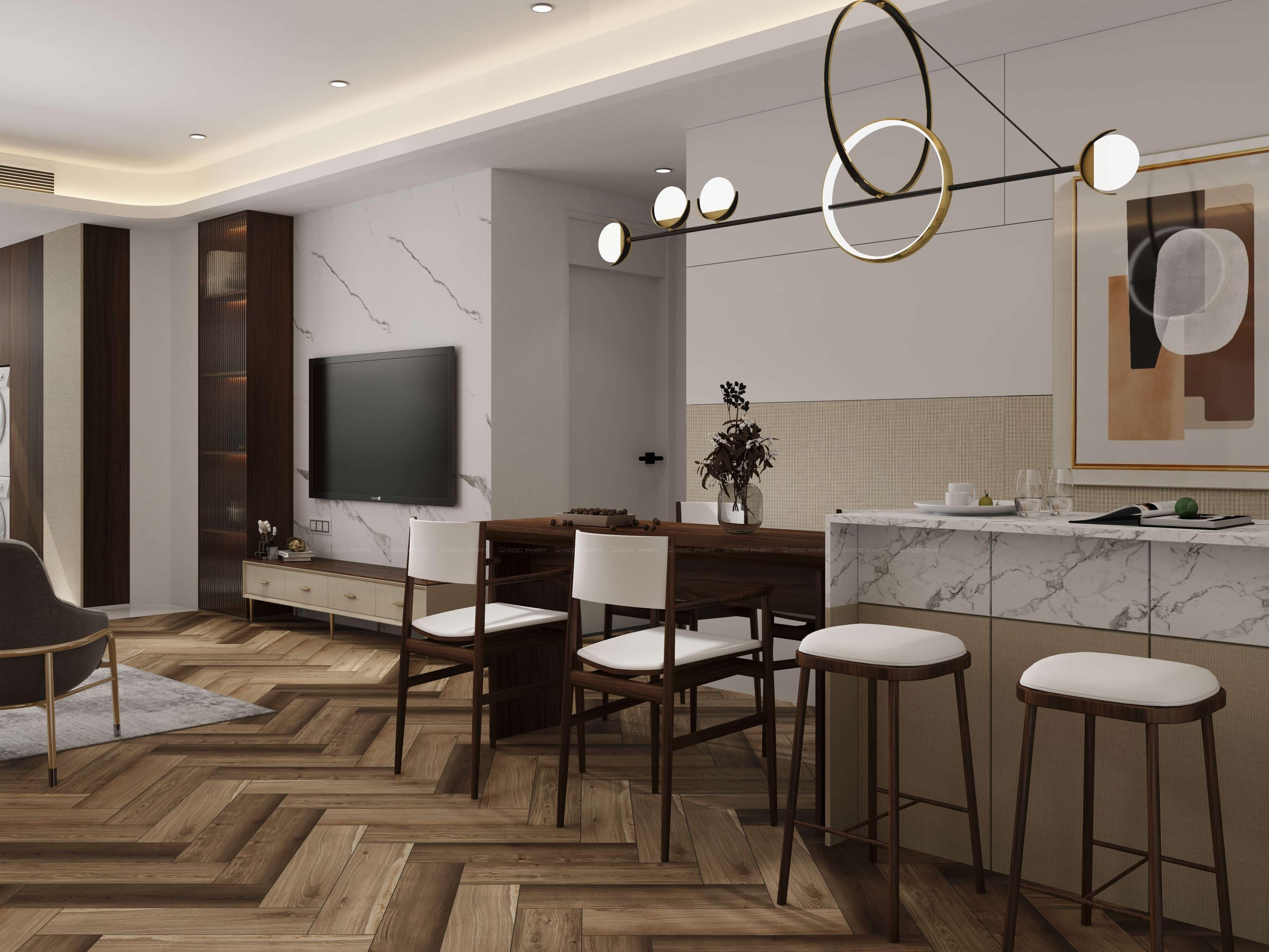
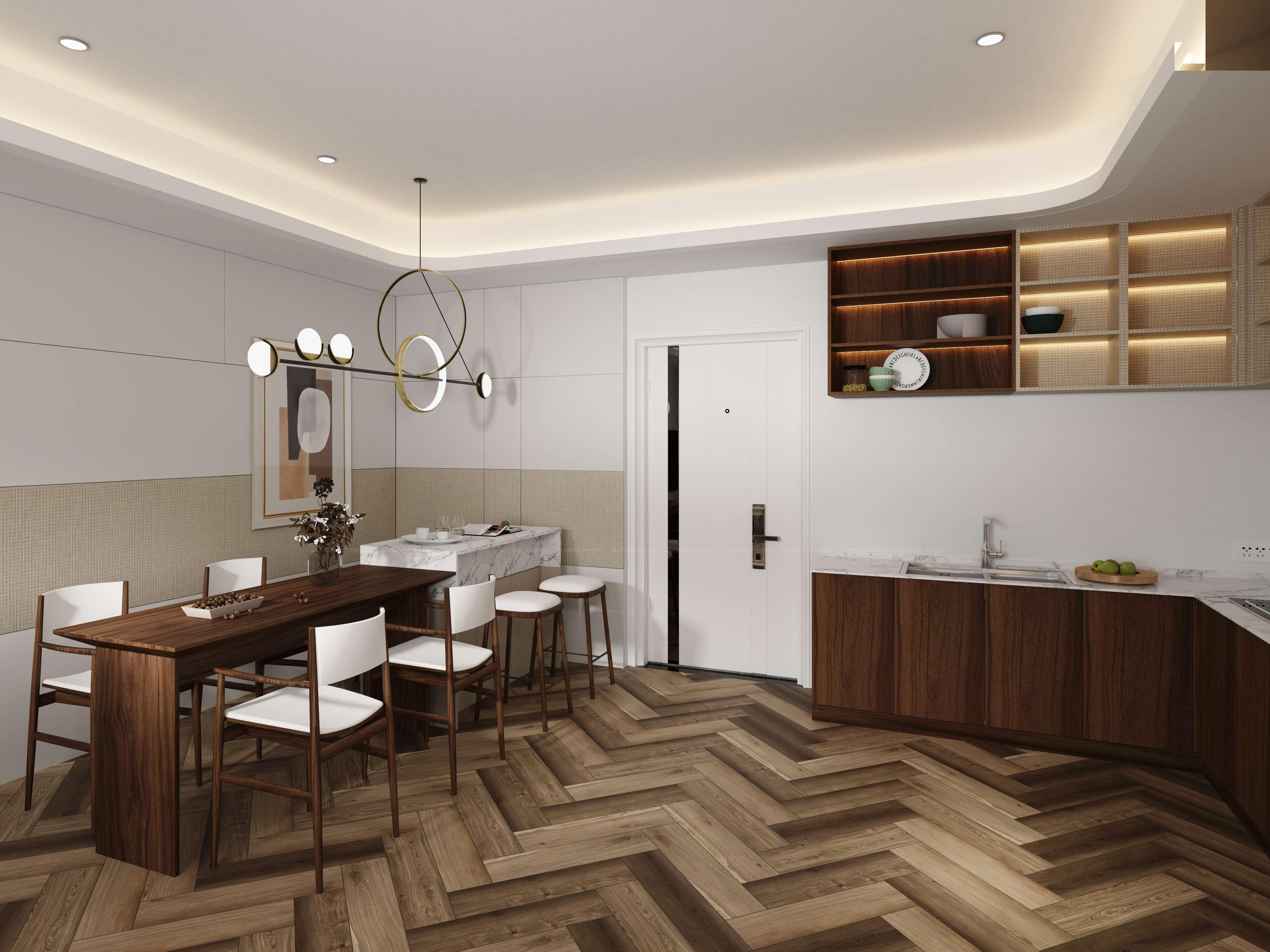
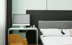
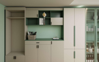
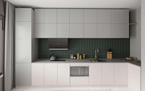
In the moodboard above, the main color palette includes neutral and natural colors such as soft green, beige, cream and pale yellow. These colors create balance, bringing a sense of elegance and closeness to nature.
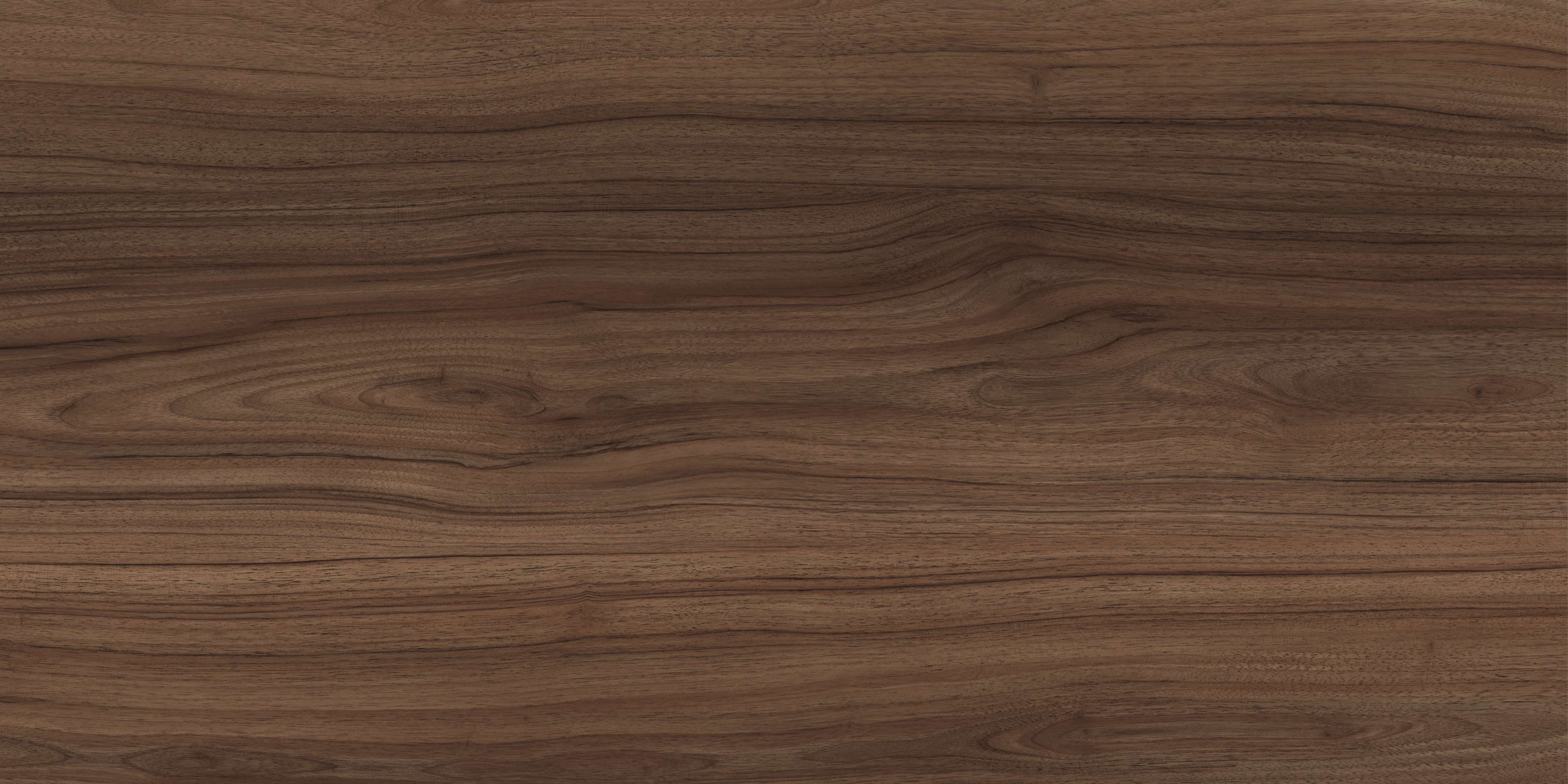
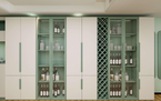
• Cool green (MS0030, MS0010): Green is the color of nature, helping the space become fresh and peaceful. When used in the interior, light green combined with natural light will make the room more spacious and airy.
• White and beige (U187 STP1, W961L STP1): These are soft colors that create a warm and relaxing feeling. Beige and cream can be used for walls, ceilings or furniture to create a subtle background, helping to highlight other decorative details.
• Linen fabric (PF425 STP3): The gentle yellow color helps the space have more highlights while still maintaining harmony.
The soft color palette not only brings a delicate beauty but also helps create a comfortable, relaxing living space. If you love minimalist, natural and elegant interior style, this color combination will definitely be a perfect choice.
Related news
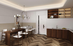
Modern Interior Space With The Sophisticated Combination Of Wood Grain MS0323 And Metallic Gray MS0125
Application of Melamine Color Codes MS0309 and MS0019 in Modern Interior Design
Moodboard _ Harmonious Combination Between Warm Fabric Color 0721 and Gentle Blue Acrylic G864
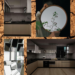
Moodboard _ Intersection of Nature and Modernity with Cracked Earth Pattern
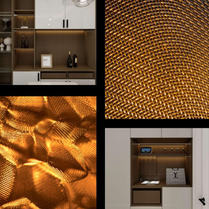
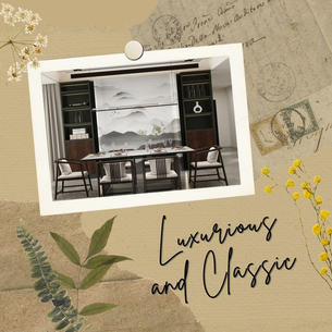
Moodboard _ When the Eye Meets Luxury
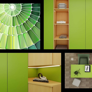
Moodboard _ Evoking Freshness and Energy with Dynamic Green
Moodboard – “Wood Flavor” of Intimate and Profound Interior Space